The market is flooded with "shimmer" paints today. You might find it tough to distinguish between high-grade options and low-quality craft alternatives. Many budget paints simply fade or lose their luster over time. Evaluating these iridescent colors requires looking far past clever marketing claims. You must understand pigment load, binder strength, and lightfastness to protect your artwork. Otherwise, you risk ruining hours of hard work on temporary, unstable finishes.
We designed this guide to give you a transparent, specification-driven framework. You will learn exactly how to select the right Acrylic pearl paint for your specific needs. Whether you work on canvas, fluid art, or custom crafts, this breakdown has you covered. We will explore everything from formulation chemistry to common application pitfalls. By the end, you can buy with total confidence.
Key Takeaways
- True acrylic pearl paint relies on coated mica flakes, not traditional metal powders, making them highly resistant to tarnishing but naturally more translucent.
- Evaluation should center on ASTM lightfastness ratings and pigment density to avoid "fading" issues common in budget brands.
- Application method (pouring vs. brushwork) dictates the necessary viscosity; fluid acrylics prevent mica sinking better than diluted heavy-body paints.
- Artist-grade and craft-grade options serve different project lifespans; choosing correctly prevents overspending on temporary pieces or compromising archival work.
Understanding the Formulation: Mica vs. Standard Metallics
The Science of the Shimmer
Manufacturers create pearlescent effects using highly specific chemistry. They use titanium dioxide-coated mica particles. These particles are then suspended in an acrylic polymer emulsion. This structure reflects light very differently than standard metallic paints. Traditional metallics use ground metal flakes to create a solid shine. Coated mica acts like a tiny prism. Light hits the titanium dioxide layer and refracts. It then passes through the mica base. This dual-action creates a dynamic, shifting shimmer. The effect changes depending on your viewing angle. True pearlescent mediums rely entirely on this light-bending property. They do not rely on sheer opacity.
Translucency as a Feature, Not a Flaw
Many beginners assume these paints should be fully opaque. This is a common misconception. High-quality pearls are inherently semi-transparent by design. This translucency is a massive advantage. It allows you to use them for complex layering and glazing. If the paint were completely opaque, the light could not penetrate the mica flakes. The resulting finish would look flat and chalky. You can leverage this transparency to build visual depth. Applying a thin pearlescent glaze over a dark base coat creates stunning results. The dark background absorbs stray light. This makes the reflective mica flakes pop intensely.
Tarnish Resistance
Standard metallic paints often contain reactive metals. Copper and bronze powders look great initially. However, they oxidize when exposed to air and moisture. They can turn green or brown over time. Pearlescent acrylics solve this problem completely. They do not contain any reactive metals. The titanium dioxide and mica are chemically inert. They will never oxidize, rust, or tarnish. This makes them inherently safer for long-term display. If you create archival artwork, this stability is non-negotiable. You can trust your finish to remain bright decades after curing.
![Acrylic Pearl Paint Swatch and Texture]()
Key Evaluation Criteria for High-Quality Pearl Acrylics
Pigment Density and Yield
You must learn how to spot cheap "fillers." Budget brands often use excess binders and minimal mica. They pad the volume with chalk or cheap extenders. These paints feel thick in the tube. However, they perform poorly on canvas. They require multiple thick coats to show any real shimmer. This repetitive layering destroys your delicate brushstroke texture. You end up with a clunky, uneven surface. Assess the cost-per-ounce carefully. Compare it against the coverage efficiency. A premium tube might cost twice as much upfront. But it often covers three times the surface area. High pigment density delivers better true product value every time.
Archival Stability and Lightfastness
Fading ruins artwork. You should always look for independent ASTM D4303 testing standards. This label guarantees the pigment has undergone rigorous UV exposure testing. Do not trust vague marketing claims. Terms like "fade-resistant" mean very little without proof. You need an accompanying Lightfastness I (Excellent) or II (Very Good) rating. Without this certification, ambient room light can bleach the color. The shimmering effect might remain, but the underlying tint will vanish. Always flip the tube over. Read the fine print before purchasing any color for a permanent project.
Viscosity and Binder Strength
The acrylic polymer ratio is critical. The binder acts as the glue holding the mica to the surface. A weak binder causes mica particles to flake off once dry. This is common in discount craft brands. You must also consider viscosity. Heavy Body acrylics retain high peaks. They hold deep textures beautifully. Fluid or High Flow acrylics are completely different. They are self-leveling and highly mobile. Fluid options are ideal for pouring and creating smooth gradients. You must match the viscosity to your specific artistic technique.
Safety and Compliance
Studio safety should be your top priority. You must verify AP (Approved Product) seals on the label. Alternatively, look for ASTM D-4236 compliance. These certifications ensure the paint is non-toxic. They guarantee it is free from hazardous heavy metals. Some unverified imported brands still use dangerous compounds to mimic metallic effects. Never risk your health for a cheaper art supply. Always check for proper safety credentials before bringing new materials into your workspace.
Performance Across Applications: Matching Paint to Process
Fluid Art and Acrylic Pouring
Pouring requires precise specific gravity. Heavy mica flakes present a unique challenge. They can easily sink beneath standard acrylics during a wet pour. If they sink, you lose the pearlescent effect entirely. We highly recommend using pre-formulated fluid pearls. These are engineered to keep the mica suspended evenly. Do not try heavily diluting standard Acrylic pearl paint with tap water. Adding too much water breaks the chemical binder. The paint will dry chalky and may even peel off the canvas. Use professional pouring mediums instead of water to adjust flow.
Traditional Canvas and Brushwork
Brushwork demands structural control. You need medium-to-heavy viscosity to manipulate the surface. When you brush the paint onto a canvas, something interesting happens. The bristles physically align the microscopic mica flakes. They lay down in the same direction. This alignment maximizes light reflection. A smooth, unified brushstroke catches the light beautifully. Scrubbing the paint randomly scatters the flakes. This scattered arrangement dulls the final shine. Heavy viscosity paints give you the drag required to control this directional reflection.
Custom Crafts and Rigid Surfaces (Wood, 3D Models)
Rigid surfaces require strong adhesion. Wood, plastic, and 3D printed models are rarely porous enough for direct application. The acrylic polymer needs something to grip. You must apply an external priming layer first. Use a high-quality gesso or a dedicated plastic primer. This prevents peeling and chipping down the line. A primer also provides a uniform background color. A solid black primer makes iridescent colors look incredibly vibrant. A white primer creates a soft, ethereal pastel effect. Always prepare your non-porous surfaces properly.
Implementation Risks: Common Pitfalls to Avoid
The "Muddy" Mixing Error
Mixing pearlescent mediums requires a delicate touch. You must never mix them with highly opaque colors. Adding titanium white or heavy earth tones destroys the iridescent effect immediately. These opaque pigments physically cover the delicate mica flakes. The light can no longer reach the titanium dioxide coating. Your expensive shimmering color will turn into a dull, muddy pastel. If you need to tint your pearlescent base, use transparent colors. Phthalo blue or quinacridone magenta work perfectly. They tint the binder without blocking the reflective mica.
Over-Dilution Failures
Water is the enemy of acrylic polymers. We strongly warn against using more than 30% water to thin your acrylics. Exceeding this ratio separates the polymer chains. The binder can no longer lock the mica onto the canvas. The dried surface will become powdery. The shimmer will rub off on your fingers. We recommend using dedicated gloss mediums instead. Gloss mediums thin the color while maintaining structural integrity. They add volume without diluting the crucial adhesive properties. This keeps your artwork structurally sound and highly reflective.
Varnish Mismatches
Your choice of final varnish can make or break the project. Matte varnishes will completely neutralize the pearlescent effect. Matte finishes contain microscopic matting agents. These agents scatter incoming light in all directions. This scattering kills the directional reflection required for the shimmer. You will lose all the depth you worked hard to build. We recommend gloss or satin finishing coats only. A high-gloss varnish actually enhances the iridescent shift. It creates a smooth, glass-like surface that amplifies the underlying mica particles.
Shortlisting Your Options: Artist Grade vs. Craft Grade
When to Choose Craft Grade
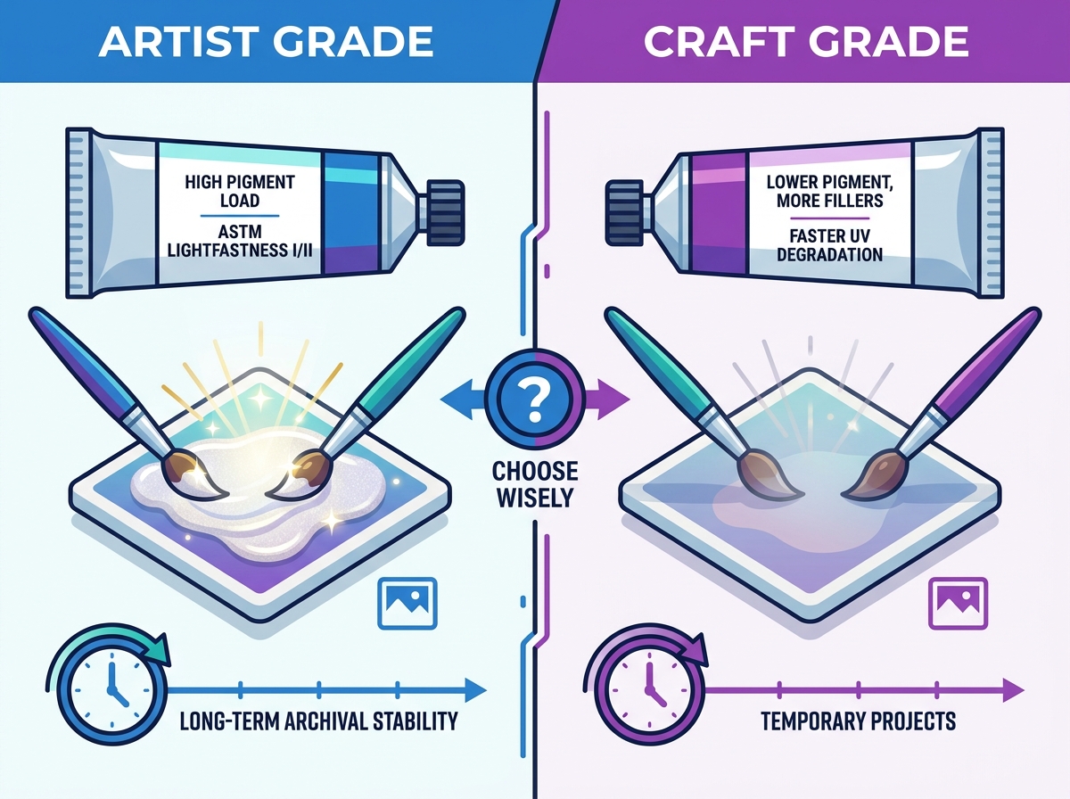
Craft-grade acrylics have their place in the studio. They are best for practice sessions and temporary DIY projects. They are excellent for learning basic pouring techniques. You can make mistakes without wasting expensive materials. We acknowledge the appealing lower price point. However, you must be aware of faster UV degradation. These paints use cheaper dyes instead of stable pigments. They will fade noticeably if left in a sunny room. Keep craft paints relegated to sketchbooks or seasonal decorations.
When to Choose Professional/Artist Grade
Professional work demands professional materials. You must use artist-grade options for commissioned artwork. They are also required for automotive-adjacent detailing and fine art. If your piece will be exposed to ambient light daily, do not compromise. We emphasize the long-term return on investment here. Artist-grade options offer massive pigment loads. They guarantee lightfastness and structural stability. Your artwork will look identical twenty years from now. The peace of mind easily justifies the higher initial purchase price.
| Feature | Craft Grade | Artist Grade |
| Pigment Load | Low (High Filler Content) | High (Maximum Mica Yield) |
| Lightfastness | Poor to Moderate (Fades quickly) | Excellent (ASTM I or II rated) |
| Binder Strength | Weak (Prone to flaking) | Strong (Archival stability) |
| Best Application | Practice, Kids' Crafts, Temporary DIY | Commissions, Gallery Art, Long-term Display |
Next-Step Action
Do not buy massive gallon sizes right away. We recommend buying a single tube of an artist-grade color first. Test it in your own studio. Check the opacity against your preferred base coats. Evaluate the mixing behavior against your existing palette. See how it handles your specific pouring medium. Once you confirm it meets your workflow needs, you can scale up. Investing in bulk sets makes sense only after you verify the performance metrics personally.
Conclusion
Selecting the right shimmering colors comes down to hard facts. You must base decisions on pigment quality and your intended application. Evaluate your viscosity needs based on your specific techniques. Prioritize archival requirements over surface-level aesthetic claims on the bottle. Remember that true mica formulation provides incredible tarnish resistance. It offers beautiful translucency for complex glazing. Protect your investment by avoiding opaque mixes and matte varnishes. Armed with these specific metrics, you can confidently source materials that deliver consistent, durable results. Your artwork deserves materials that will stand the test of time.
FAQ
Q: Does acrylic pearl paint need a base coat to show up?
A: Yes. Due to their natural translucency, a solid base coat significantly enhances the iridescent shift. A dark or complementary background color absorbs stray light. This makes the reflective mica flakes pop much more intensely than on bare white canvas.
Q: Can I mix pearl acrylic paint with standard acrylics?
A: Yes, but you must be careful. You should only mix them with transparent or semi-transparent colors. Mixing them with heavy, opaque colors will block the mica's reflective properties. This results in a flat, muddy finish.
Q: Why is my acrylic pearl paint drying flat instead of shiny?
A: Several common issues cause this. You might be applying it over a highly absorbent surface without a primer. You could be over-thinning it with too much water. Alternatively, you might be using a matte pouring medium that scatters the light.
Q: Is pearl paint the same as iridescent medium?
A: No. Pearl paint features specific color pigments and mica combined into a ready-to-use color. Iridescent mediums are transparent acrylic binders mixed with mica. You use these mediums to turn any standard transparent color into a pearlescent finish.