Silver presents a unique visual puzzle in surface design. It acts as a highly reflective, neutral base layer. Paired poorly, this gleaming shade quickly looks flat. It can easily appear washed out or overly industrial. Selecting the right contrasting color directly dictates the perceived value of your final product. This reality applies across automotive customization, product fabrication, and high-end modeling. A substandard finish ultimately ruins your design's aesthetic depth.
We must look beyond standard color wheels to achieve truly striking results. You need a reliable framework for evaluating advanced finish options. We will explore how different pigments interact visually. Specifically, we will demonstrate how dynamic materials like Pearl Paint interact alongside a silver base. These combinations produce breathtaking, premium results.
Key Takeaways
- High-contrast cool tones (deep blues, charcoals) and rich warm tones (crimson, burnt orange) provide the most reliable visual distinction against a silver base.
- Pearl paint offers a superior alternative to standard metallics when paired with silver, providing color-shifting depth without muddying the base layer's reflectivity.
- Evaluating paint choices requires balancing aesthetic goals with implementation realities, as pearl and metallic finishes demand stricter surface preparation and application expertise.
- Final color selection should be dictated by the lighting environment (indoor vs. outdoor) and the desired outcome (subtle elegance vs. high-visibility impact).
The Visual Dynamics of Silver: Why Pairing Matters
Silver presents a fascinating challenge in material design. It behaves almost exactly like a mirror. It constantly reflects surrounding light and environmental colors. Professionals measure this behavior using the Light Reflectance Value scale. Silver possesses an exceptionally high LRV rating. This intense reflectivity creates a distinct design hurdle. Low-contrast color pairings fail almost every time. Colors like pale yellow lack necessary visual weight. Light grey blends directly into the substrate. They cannot stand out against such a bright background. You lose all edge definition. Instead, the entire project takes on a muddy appearance.
You must define clear success criteria for your design project. A successful color pairing always achieves strong visual separation. You can accomplish this goal using two reliable methods. First, you might use a secondary color to anchor the base. Dark, light-absorbing tones handle this task beautifully. They provide a solid visual boundary. Second, you can use an accent color to cut through the brightness. Highly saturated tones achieve this effect perfectly. They grab attention immediately.
Color selection represents only half of your design equation. The physical finish heavily dictates the final appearance. Matte finishes absorb ambient light completely. They create a flat, muted contrast. Gloss finishes bounce light aggressively. Standard metallic options add a sharp, jagged sparkle. Alternatively, advanced options like Pearl Paint introduce sophisticated refraction patterns. They bend incoming light gently across the surface. This interaction completely transforms how we perceive the underlying silver layer.
Evaluating the Best Color Categories for a Silver Base
Designers categorize optimal contrasting colors into three distinct groups. Each group serves a specific aesthetic purpose. We must evaluate them based on their final visual impact.
Deep Cool Tones (High Authority & Contrast)
- Colors: Navy blue, cobalt, deep violet, and charcoal.
- Outcomes: These shades create a sleek, modern aesthetic. Dark blues absorb incoming light beautifully. This light absorption allows the silver base to pop vividly. Professionals consider this the lowest-risk pairing. It yields incredibly high rewards for commercial applications. Deep cool tones project authority. They maintain a professional appearance across different lighting environments.
High-Energy Warm Tones (Aggressive & Sporty)
- Colors: Crimson red, burnt orange, and rich burgundy.
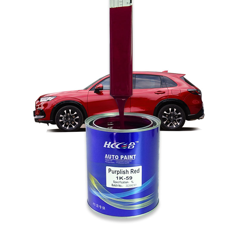
- Outcomes: Warm tones generate intense visual tension. They advance visually toward the viewer. The silver base simultaneously recedes into the background. This interplay creates a striking three-dimensional effect. Automotive accents benefit greatly from this dynamic. High-energy warm tones demand immediate attention. They transform a basic silver canvas into an aggressive focal point.
Achromatic & Monochromatic (Subtle & Scalable)
- Colors: Gunmetal, stark black, and white.
- Outcomes: Monochromatic palettes offer safe, scalable solutions. They remain incredibly easy to color-match across different batches. Black provides the ultimate stark contrast against bright silver. It outlines complex geometries perfectly. Gunmetal offers a more sophisticated visual transition. It bridges the gap between light and dark seamlessly. White provides a clean, clinical appearance.
![Silver and pearl paint combination application]()
Why Pearl Paint is the Ultimate Enhancer for Silver
Let us define the physical differences between standard pigments and advanced formulations. Standard metallics use microscopic aluminum flakes. These flakes act like tiny, flat mirrors. They provide a straightforward, uniform sparkle. Pearl Paint operates on entirely different physical principles. It utilizes finely crushed mica or synthetic additives. These particles act like microscopic prisms. They refract light rather than simply reflecting it. This refraction creates profound depth. It also produces a captivating color shift as your viewing angle changes.
You unlock massive potential when applying interference pearls. Professionals apply these translucent mid-coats directly over the bright base. The silver layer acts as a powerful light reflector. It bounces light back up through the translucent mica particles. This interaction maximizes the color shift. Industry experts call this shifting phenomenon the "flip." It yields a premium, multi-dimensional finish. Standard solid colors simply cannot replicate this complex aesthetic. The surface appears alive and dynamic.
Ghost pearls offer another fascinating application technique. Consider applying a subtle blue or violet pearl over a bright base. The piece looks traditionally silver in low-light environments. It maintains a subtle, understated elegance indoors. Direct sunlight changes everything instantly. The intense UV rays activate the mica particles. They reveal a vibrant secondary color. This technique gives you a fantastic two-in-one aesthetic. It rewards closer inspection while maintaining broader visual appeal.
Decision Framework: Solid vs. Metallic vs. Pearl Paint
Selecting the correct paint format requires careful evaluation. You must weigh your aesthetic goals against application realities. We compiled a comprehensive comparison chart below. It outlines the primary differences between these three major categories.
| Paint Type | Key Benefits | Primary Application Risks | Ideal Use Cases |
| Solid Colors | High opacity, easy application, easily reproducible results. | Can look plasticky or flat next to bright metallic layers. | High-wear components, heavily utilized commercial vehicles. |
| Metallic Paints | Matches industrial feel, excellent coverage, decent sparkle. | Risk of "metallic clash" if flake sizes compete visually. | Machinery, blended transitions, large surface areas. |
| Pearl Finishes | Unmatched visual depth, seamless transition, premium appearance. | Complex multi-stage application, demands strict surface prep. | Luxury customization, high-visibility showpieces. |
High opacity defines solid color choices. They remain incredibly easy to spray. You can reproduce them accurately across multiple separate sessions. This simplifies your resource allocation significantly. However, they carry specific visual risks. Solid colors often look plasticky. They lack depth when placed directly next to highly reflective silver. This creates a disjointed appearance across the finished project.
Metallic options match the industrial feel perfectly. They usually provide excellent coverage during application. Yet, you must watch out for specific visual hazards. A "metallic clash" occurs frequently. This happens when the flake sizes between the two layers compete. A coarse accent flake clashes horribly against a fine base flake. They must complement each other perfectly. Otherwise, the finish looks cluttered and messy.
Using Pearl Paint guarantees unmatched visual depth. It ensures a seamless visual transition alongside adjacent panels. It instantly elevates the perceived value of your work. The downsides involve application complexity. You must execute a strict multi-stage application process. You apply a base coat, a mid-coat, and a final clear coat. Furthermore, these finishes prove significantly harder to touch up later. A minor scratch often requires entirely repainting the affected panel.
Implementation Realities and Application Risks
Executing advanced finishes demands strict adherence to professional protocols. You cannot cut corners during the application phase. The bright underlying layer amplifies every single mistake.
Silver shows every tiny scratch. It highlights microscopic surface imperfections instantly. You must ensure a flawless primer stage. We recommend finishing your primer block-sanding with P800 grit sandpaper. This becomes especially critical before applying translucent mid-coats. Pearls magnify existing substrate flaws dramatically. A wavy primer layer ruins the final light refraction. The surface must resemble glass before you spray your base.
Spraying silver and pearl finishes introduces specific physical risks. You must manage your equipment perfectly.
- Uneven application leads directly to pigment pooling.
- Inconsistent air pressure creates visible tiger striping across the panel.
- Poor spray gun calibration ruins the delicate flake distribution.
- Incorrect flash times trap dangerous solvents beneath the surface.
You must utilize controlled overlap techniques. Professionals recommend a strict fifty-percent overlap pattern. This ensures an even distribution of the delicate mica particles.
Final protection matters immensely. Both bright bases and delicate mid-coats require high-quality top coats. You must use premium, UV-resistant formulas. A two-component polyurethane clear coat works best. The clear coat physically locks in the refracted light effect. It provides the smooth lens necessary for light to travel. It also protects the fragile mica flakes. Without this robust barrier, the finish suffers rapid oxidation. It will fade and peel under direct sunlight exposure.
Conclusion
Choosing the correct accent demands strategic planning. You must evaluate the final environment of your project. For heavily used applications, choose solid high-contrast cool tones. Colors like navy or stark black perform reliably. They provide excellent visual separation. They also remain incredibly easy to repair later.
For premium projects, leverage the natural reflectivity of your base layer. Invest the necessary time into applying Pearl Paint. This decision unlocks unmatched aesthetic depth. It transforms a standard industrial finish into a dynamic, multi-dimensional showpiece. The visual reward easily justifies the complex application process.
We advise ordering physical spray-out cards immediately. Never commit to a full-scale rollout blindly. Test your chosen base and accent combination under multiple lighting conditions. Compare them in direct natural sunlight first. Then, evaluate them under artificial shop lighting. This simple verification step prevents costly rework later.
FAQ
Q: Can I mix pearl paint directly into a silver base coat?
A: Yes, you can physically mix them. However, this method usually ruins the desired visual effect. The opaque aluminum flakes found in the base overpower the translucent mica. This overpowering action drowns the delicate color shift completely. Industry standards dictate a staged application instead. You should apply the base first. Then, follow it up using a dedicated mid-coat. This staging guarantees maximum visual impact.
Q: What is the worst color to pair with silver?
A: Low-saturation warm tones perform terribly. Avoid pale yellow, basic beige, or light brown. These shades lack the necessary contrast to stand out. Because the substrate has a high light-reflectance value, it overpowers these weaker tones. Pairing it with weak warm tones makes the entire project look dirty, aged, or oxidized.
Q: Does pearl paint last as long as standard automotive paint?
A: Yes, it offers the exact same lifespan. However, durability depends entirely on your clear coat, not the mid-coat itself. The fragile mica flakes require robust protection from UV rays and moisture. As long as you apply and maintain a high-solids, 2K clear coat, your premium finish will last for years.