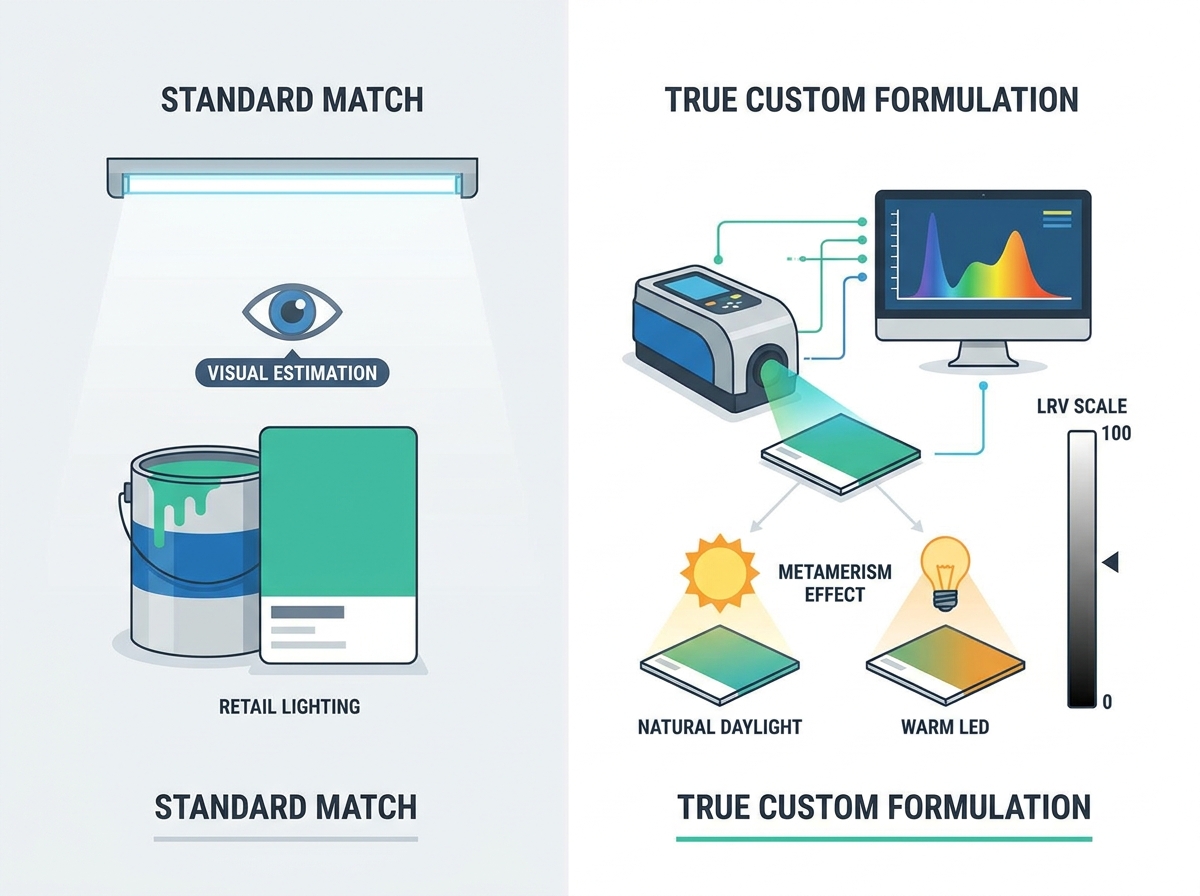
Selecting the perfect hue goes far beyond picking a paper swatch from a hardware store display. Many buyers fail to realize the critical difference between off-the-shelf catalog colors and true custom formulation. Getting this choice wrong carries incredibly high stakes for any project. A mismatched shade easily ruins aesthetic consistency across a property. It also compromises your overall renovation budget. Color-matching failures in high-end projects cause frustrating delays and expensive rework. Finding the exact right tone demands a scientific approach.
This guide provides an objective framework for evaluating formulation quality. We will explore technological limitations and teach you how to vet application professionals properly. You will learn exactly what makes a specific formulation succeed or fail in the real world. By understanding these chemical and environmental factors, you can protect your investment. Let us examine the reality of mixing perfect shades for your next major build.
Key Takeaways
- True custom color matching relies on spectrophotometer technology and specific tinting bases, not just visual estimation.
- Lighting conditions and paint sheen significantly alter perceived color; evaluating Light Reflectance Value (LRV) and metamerism is non-negotiable.
- The durability of a custom color is dictated by pigment load and the quality of the un-tinted base.
- Successfully deploying custom paint requires vetting contractors on their sampling protocols (drawdowns and live mockups) before full-scale application.
The Reality of Custom Color Formulation: Why Standard Matching Fails
Consumers often experience intense choice paralysis during renovations. Walking into a massive retail store overwhelms many people instantly. Retailers regularly promise 100% perfect matches across different brands. This marketing promise is usually false. Standard visual matching cannot account for underlying chemical differences. Achieving a true match requires a much deeper, scientific approach. You cannot simply scan a competitor swatch and expect perfection on your walls.
The metamerism problem is a massive factor in design failures. Colors often look completely identical under retail fluorescent lights. However, they clash dramatically under residential natural lighting. They also change significantly under modern home LED bulbs. We call this optical phenomenon metamerism. It routinely ruins carefully planned interior designs. You might love a sample inside the store. Then, you might hate it inside your living room. Lighting dictates everything in design.
Furthermore, we must always consider base paint variances. Different manufacturers use wildly different chemical base formulations. Some brands rely heavily on stark white bases loaded with titanium dioxide. Others utilize completely clear bases for deep shades. This fundamental difference makes cross-brand matching chemically unpredictable. A high-quality Custom color paint requires absolute precision. Rigorous physical testing remains mandatory. You must demand accuracy from your provider at every step.
![Custom color evaluation tools and color swatches on a table]()
Core Evaluation Criteria for Custom Color Paint Quality
Technological Precision (Spectrophotometry)
Visual swatch comparisons are highly subjective and prone to error. Human eyes frequently fail to detect subtle undertone variations. Accurate matching demands the use of high-grade spectrophotometers. These advanced devices measure light reflectance precisely across the visible spectrum. They analyze the exact wavelength of the sample. Demand this specific technology from your local provider. Relying on visual estimation almost always guarantees failure in high-end applications.
Pigment Volume Concentration (PVC) and Binder Quality
Pigment load directly dictates long-term fade resistance. It also determines overall wall scrubbability. High pigment loads offer stunning visual depth. However, they occasionally compromise critical UV stability. High-quality binders lock these heavy pigments firmly in place. Assessing this trade-off is critical for long-term project success. Ultra-deep hues usually demand premium binders. These binders ensure long-lasting durability against daily wear and tear.
- Low PVC Formulations: Glossy, highly durable, and very easy to wash.
- High PVC Formulations: Matte, rich in depth, but susceptible to scuffing.
- Binder Resins: Acrylic and latex binders provide the necessary adhesion and flexibility.
The Impact of Finish and Sheen
Gloss level drastically alters perceived visual depth. Flat finishes absorb incoming room light. They soften the overall appearance on the wall. High-gloss finishes reflect light aggressively back into the room. This intensifies and darkens the underlying hue. Always evaluate your chosen shade in its final sheen. A matte sample will never match a high-gloss application perfectly. Sheen fundamentally changes the geometric angle of light reflection.
The Psychology of Space: Factoring in Light and Architecture
Light Reflectance Value (LRV)
LRV operates on a strict mathematical 0-100 scale. Pure black registers at 0. Pure white hits 100 on the scale. LRV predicts how a hue performs in specific spatial conditions. Rooms lacking natural light need much higher LRV ratings. High sun exposure areas handle lower LRV options beautifully. Understanding LRV prevents enclosed spaces from feeling overly cavernous. It helps designers balance light absorption and reflection perfectly.
Environmental Color Shifting
Surrounding architectural elements create significant implementation risks. Hardwood flooring casts distinct orange reflections onto white walls. Custom cabinetry and outside foliage do the exact same thing. A large green tree outside will turn a neutral room slightly green. These reflections actively alter the final appearance. You must take a data-backed approach to spatial psychology. Align underlying undertones based on the intended function of the space. Match the psychological mood to the room's daily purpose.
Standard Catalog vs. True Custom: An ROI Analysis
When should you rely strictly on catalog colors? Low-risk areas benefit greatly from standard options. Standard commercial apartment turns are excellent examples. Highly standardized brand environments also work well here. They do not demand intense scrutiny or microscopic perfection. Using standard catalogs saves time during simple, rapid property turnovers.
When should you invest in a complex custom formulation? Historic restorations demand exact replication of original materials. Custom architectural builds require perfect harmony between indoor and outdoor elements. Precise fabric matching relies on highly customized mixing processes. Distinct brand identity enforcement also requires exact, unvarying hues. High-stakes environments easily justify the extra developmental effort.
A careful cost-to-outcome assessment reveals interesting financial realities. Custom formulation definitely carries a higher upfront premium. However, it prevents massive long-term correction costs. Client dissatisfaction leads to rapid repainting. Rapid color degradation wastes significant labor money. Proper chemical mixing saves vital resources eventually. You only want to paint a room once.
Table 1: ROI Assessment Comparison
| Project Factor | Standard Catalog Option | True Custom Formulation |
| Upfront Material Cost | Lower baseline expense | Higher premium expense |
| Matching Precision | Approximate visual match | Exact spectrophotometer match |
| Application Risk | High risk of metamerism | Low risk due to exact base matching |
| Long-term Durability | Variable based on brand | Optimized via specific binder selection |
Vetting Contractors and Managing Implementation Risks
Mandatory Proof of Concept (Drawdowns)
Buyers must demand physical drawdowns from their contractors. These are physical painted samples on stiff cardboard cards. They must feature the exact chemical base and final sheen. Never authorize a full multi-gallon purchase without this physical proof. Drawdowns expose minor mixing errors extremely early in the process. They serve as a physical contract of expectations.
Large-Scale Mockups and Box Testing
Paint a large section directly on your wall. You can also paint a functional box corner. Observe the hue through a full 24-hour daily light cycle. This rigid protocol reveals how shadows interact throughout the day. Direct morning sunlight changes everything. Evening artificial light shifts the tone again. You must see these dynamic shifts before applying the final coat everywhere.
Interviewing Application Professionals
Ask highly specific questions before hiring any painting professional. Vague answers indicate a lack of technical expertise. Use these mandatory questions during your interview process:
- "How do you handle batch consistency?" They should explain their mixing ratios clearly.
- "What is your exact protocol for touch-up matching?" They must outline how they save formulas.
- "Do you box your material to ensure uniformity?" Boxing means mixing multiple gallons together in one large bucket.
Boxing entirely eliminates minor batch-to-batch chemical variations. It guarantees a perfectly uniform finish across massive walls. Professionals who skip this step often leave visible color variations on large surfaces.
Conclusion
We must shift from subjective selection to objective evaluation. Successful projects rely equally on chemical formulation and lighting awareness. Rigorous contractor testing is strictly mandatory. Stop guessing and start measuring your materials. Your next step is incredibly clear. Schedule a professional color consultation immediately. Request a physical drawdown from your chosen provider. Initiate contractor interviews using these strict technical criteria. Taking these definitive actions protects your investment and ensures perfect aesthetic results.
FAQ
Q: Can any paint brand perfectly match another brand's custom color?
A: No. Cross-brand matching is chemically unpredictable. Different brands use proprietary colorants and varying base formulations. A white base from one company reacts differently than a clear base from another. You must conduct rigorous physical testing to ensure accuracy.
Q: Why does my custom paint look different on the wall than in the can?
A: Wet material looks vastly different than dry material. Drying time alters the initial appearance significantly. Sheen development changes how light reflects off the surface. Different light sources in your room also cause visual shifts. You must wait for a full cure to see the final result.
Q: Are custom dark colors less durable than lighter colors?
A: Yes, they can be. Dark hues require heavy tint loads. This alters the critical binder ratio. Heavy pigments often reduce overall scuff resistance. Using premium bases mitigates this issue. Always specify high-quality binders when formulating deep shades.
Q: How do I ensure future touch-ups match my custom color?
A: Save the specific formulation sticker from the original can. Record the exact batch number in your project files. Keep a small reserve of the original material stored properly. This guarantees you have the precise chemical makeup for future repairs.