When you prepare a surface for fresh paint, you likely reach for standard white or flat black. Many people simply default to these extreme base coats. This habit leads you to wonder if a neutral alternative even exists. Yes, Grey Primer is highly common today. Experts widely consider it the industry standard for specific high-contrast color transitions. We see this heavily in commercial interior painting and detailed hobby work. Using the wrong color primer always results in poor coverage. You will waste valuable topcoat layers. Your final color presentation will ultimately look skewed. This article defines exactly when a neutral base is functionally necessary. You will learn how to evaluate different chemical formulations accurately. We will help you choose the right product for your specific substrate and topcoat. You can then confidently tackle difficult color transitions without wasting effort.
Key Takeaways
- Optical Efficiency: Grey primer provides a neutral undertone that requires fewer topcoats to achieve full opacity, especially for notoriously difficult colors like vivid reds, yellows, and deep blues.
- Formulation Over Color: Not all grey primers perform equally; selection must be based on substrate adhesion needs (e.g., bonding vs. high-build) rather than color alone.
- The "2-in-1" Myth: While "paint-and-primer-in-one" grey products exist, dedicated grey or custom-tinted primers offer superior hide and adhesion for significant color transitions.
- Dual-Industry Standard: Grey is uniquely positioned as the optimal base for both architectural dark-wall transitions and miniature painting where contrasting details matter.
The Functional Role of Grey Primer: Solving the "Hide" Problem
The Core Problem
Transitioning from a light wall to a dark color poses a unique challenge. Moving from dark back to light presents similar hurdles. Using a standard white primer requires excessive coats of finish paint. You must overcome the aggressive light reflection of the white base. Bright white grounds reflect incoming light directly through your topcoat. This forces you to add more layers of expensive finish paint. It is the only way to achieve true color opacity.
The Science of "Hide"
We must understand how a Grey Primer absorbs light dynamically. A mid-tone grey successfully neutralizes the stark reflectivity of a pure white base. It simultaneously softens the heavy, light-swallowing nature of a black base. The science of "hide" relies on blocking light transmission. White contains high levels of titanium dioxide. This mineral scatters light heavily. Dark topcoats simply lack enough pigment to block this scattered light. A neutral grey sits precisely in the middle of the optical spectrum. It absorbs just enough light to support dark pigments. It reflects just enough light to keep colors looking vibrant.
Cost and Time Efficiency
Investing in a specialized neutral base fundamentally changes project efficiency. It heavily reduces the total volume of premium finish paint you need. You will cut labor and drying time drastically. You eliminate the dreaded need for a third or fourth topcoat. Professional painters rely on this optical efficiency daily. It keeps project schedules tight and prevents massive material overages.
- Reduced material volume: You apply two topcoats instead of four.
- Faster turnaround: You skip hours of intermediate drying time.
- Predictable results: The final color closely matches the manufacturer swatch.
![Application and selection of grey primer across different surface substrates]()
Use Cases: When to Specify Grey Over White or Black
Architectural & Interior DIY Painting
Certain interior environments demand a neutral undercoat for success. Deep and vibrant topcoats absolutely require this intermediate step. You will find it essential when applying jewel tones. Dark navies, deep greens, and vibrant reds are notoriously transparent. They struggle to hide the substrate beneath them. A neutral base gives these colors a proper foundation to build upon.
Drastic color transitions also necessitate this specific approach. You will face challenges when covering existing dark or bold walls. A neutral base resets the surface back to a balanced state. It does this without the stark chalkiness of pure white. You avoid the ghosting effect where old patterns bleed through the new paint.
Miniature & Scale Model Painting
Hobbyists use specific undercoats for entirely different practical reasons. Detail visibility stands as a primary concern for miniature painters. Grey provides the perfect mid-tone contrast for bare plastic or resin. You can easily spot mold lines and fine model details. You can fix these physical imperfections before applying any base coats.
Zenithal highlighting relies heavily on this intermediate shade. You layer black, grey, and white sprays from different angles. This technique creates artificial volumetric shadows instantly. The mid-tone serves as the crucial transition shade. It connects the deep black shadows to the bright white highlights. It prevents chalky textures from forming in the middle ranges.
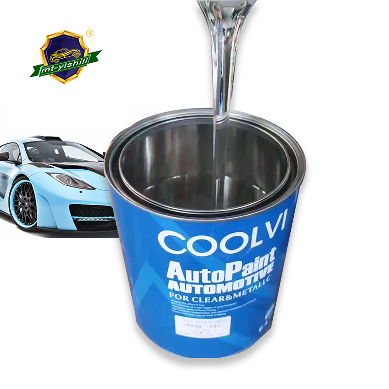
Automotive and Metal Refinishing
Auto body repair leans on intermediate shades for physical feedback. A neutral base acts as a reliable guide coat. It highlights surface imperfections better than pure white. You can clearly see scratches, pinholes, and tiny dents. This visibility allows for precise block sanding before the final color coat. Mechanics and restorers depend on this contrast. It guarantees a perfectly flat panel prior to applying the expensive clear coat.
Evaluation Criteria: Selecting the Right Grey Primer
Tinting vs. Pre-Mixed Grey
You can source these products in two primary ways. Factory grey represents off-the-shelf, pre-mixed solutions. These are ideal for general use and hobbyists. They offer consistent, repeatable results straight from the can or rattle can. You never have to worry about batch variations.
Custom tinting involves modifying white primers at the hardware store. Technicians use specific grey-scale formulas to achieve exact shades. Industry standards often use a P1 through P6 shading scale. P1 is a very light shade. P6 is extremely dark. You match the lightness value of the base exactly to your intended topcoat. This custom approach provides maximum optical efficiency for difficult architectural colors.
Chemical Formulation (Matching Substrate to Solution)
You must match the chemical makeup to your specific physical surface. A Grey Primer comes in several distinct formulations. Choosing the wrong chemistry leads to massive peeling failures.
| Formulation Type | Ideal Substrates | Key Characteristics |
| Acrylic / Latex | Standard drywall, interior walls, lightly sanded surfaces. | Low VOC emissions, fast drying times, easy water cleanup. |
| Oil-Based / Polyurethane | Bare wood, heavy stains, slick plastics, exterior trims. | Aggressive bonding, blocks water stains, seals porous grains. |
| Enamel / Lacquer (Spray) | Metal auto parts, 3D printed resin, hard plastics, miniatures. | Self-leveling, extremely thin coats, fast evaporation, strong bite. |
Performance vs. Claims
You must carefully evaluate "Paint-and-Primer-in-One" products on the market. Manufacturers heavily promote these two-in-one solutions to save time. You should evaluate them strictly as high-hide paints. They lack the dedicated bonding agents found in true standalone products. They do not penetrate substrates the way a dedicated base coat does. For significant color transitions, they often fail to deliver true opacity. You will likely still need three coats to hide dark walls. Always use a dedicated intermediate base for drastic changes.
Implementation Realities & Common Rollout Risks
Over-Tinting Failures
Many DIY enthusiasts attempt to mix their own custom shades. They manually tint a white base with leftover dark paint. This creates severe chemical binding issues. Adding too much standard colorant alters the paint chemistry. It dilutes the specific bonding resins inside the can. The product may never fully cure. It might lose its ability to block stains. Always use professional tinting services. Alternatively, stick to pre-mixed factory solutions.
Value Mismatching
Optical mismatching remains a highly common project mistake. Using a very light base under a dark topcoat causes bleed-through. The dark color looks washed out and lacks depth. Conversely, using a dark base under a light yellow kills the brightness. The yellow will look muddy and green-tinged. The lightness or darkness value must perfectly align with your finish coat. A mid-tone neutral is versatile, but extreme ends require specific P-scale matching.
Texture and Build-Up Risks
Environmental factors drastically affect aerosol applications. This is critical in miniature painting and automotive panel work. Spraying from too far away allows the paint to dry mid-air. This causes the base to "fuzz" upon impact. High humidity causes the aerosol to pool heavily in recesses. Both issues obscure the tiny details the undercoat is meant to highlight. You must control your spraying environment carefully.
Best Practices for Aerosol Application:
- Shake the can vigorously for a minimum of two minutes.
- Keep the nozzle exactly 8 to 12 inches from the surface.
- Apply in short, sweeping bursts rather than holding the nozzle down.
- Only spray when humidity falls below 60 percent.
Curing Time Miscalculations
You must understand the difference between touch-dry and fully cured. Tinted products often require longer curing times. Tinted oil-based variants are especially notorious for this delay. They need extra time before you can safely apply a topcoat. If you topcoat too early, you trap escaping solvents. This causes the final layers to bubble, wrinkle, or peel. Always consult the technical data sheet for precise curing windows.
Shortlisting Logic & Next Steps
Step 1: Define the Finish Coat
You must first analyze your final intended color. Is the final color highly pigmented, vibrant, or dark? Look closely at vivid reds, deep greens, and rich blues. If yes, you should shortlist a medium-to-dark undercoat. If you are painting pastel shades, stick to a lighter value. The topcoat dictates your entire foundational strategy.
Step 2: Assess the Surface
You must evaluate what you are actually painting over. Are you painting over heavy water stains or bare wood? Are you dealing with slick plastic or standard paper drywall? Your surface directly dictates your chemical choices. Stains and slick surfaces demand oil-based or polyurethane formulations. Standard drywall and previously painted matte walls accept water-based acrylics perfectly.
Step 3: Decide on Sourcing
You must finally select where and how to buy your product. The industry dictates different sourcing paths.
- For models and miniatures: Purchase dedicated hobby-grade spray primer. Look for polyurethane or specialized acrylic formulas designed for self-leveling.
- For interior walls: Request a commercial-grade white base. Ask the paint desk to tint it to a specific value. Use your paint manufacturer’s specific color system, such as a designated grey shade system.
- For auto parts: Source an automotive-grade lacquer or enamel guide coat. Ensure it is specifically rated for metal adhesion and wet sanding.
Conclusion
A neutral grey base is highly real and readily available. Industry professionals often find it far superior to standard white or black options. Choosing this specific shade is a highly strategic decision. It guarantees better topcoat color accuracy across your entire project. You will spend fewer wasted hours waiting for excessive layers to dry. You will ultimately build a more durable, opaque finish.
Before you begin your next major project, review your materials carefully. Check your finish paint's technical recommendations. Determine the exact recommended primer shade before you ever pick up a brush. A little upfront preparation ensures flawless color transitions and protects your investment.
FAQ
Q: Can I just mix black and white primer together to make grey?
A: Technically yes, if they share the exact same chemical formulation. Mixing an acrylic white with an acrylic black works for simple craft projects. However, for large interior walls or specific adhesion needs, this risks uneven pigment distribution. It is always safer to purchase professionally mixed or tinted products.
Q: Will grey primer make my final paint color look darker?
A: It will not make the color darker if you use the correct value. It actually helps deep colors achieve their true richness faster. However, if you use a dark undercoat beneath a pale pastel, the topcoat will appear muddy. Always match the primer value to the topcoat value.
Q: Do I need grey primer if I am using a "paint and primer in one"?
A: Yes, for drastic color changes. Two-in-one products are essentially just thicker paints. They do not block underlying colors as effectively as a dedicated neutral base. If you are painting deep navy over a bright yellow wall, a separate neutral undercoat saves you multiple topcoats.
Q: How dark should my grey primer be for a navy blue wall?
A: You should aim for a medium-dark shade. In professional tinting systems, this is usually a P4 or P5 value. This darkness level absorbs the light that navy blue cannot block. It prevents the original wall color from bleeding through the blue finish.
Q: Is grey primer suitable for ceiling paint applications?
A: Generally, no. Most ceilings are painted flat white. Using a neutral base under a white ceiling will force you to apply extra coats of white to cover the darkness. You should only use it on ceilings if you plan to paint the ceiling a dark or vibrant color.